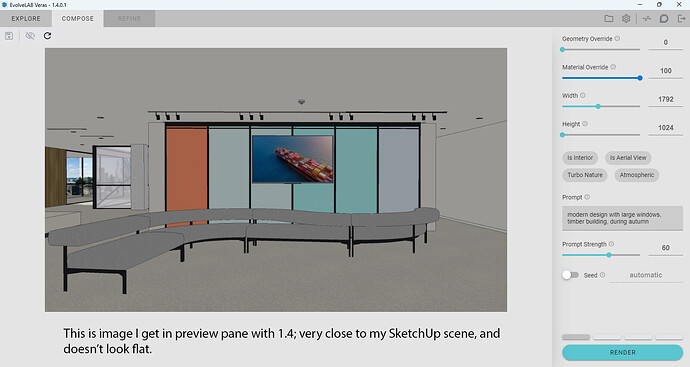
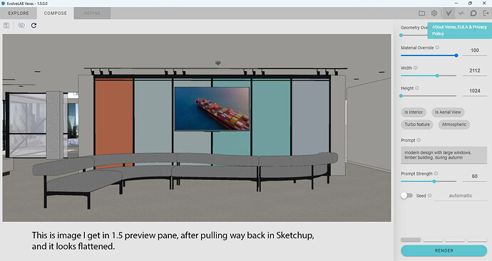
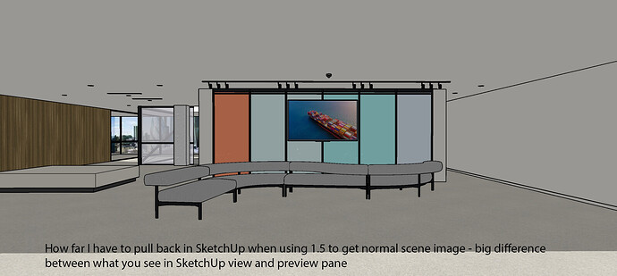
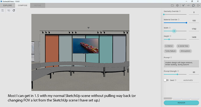
In the preview pane 1.5 seems to be flattening the image out. I did pull way back on the image to get more of it in the picture, but didn’t change the FOV, so I don’t know why it looks so flat. But I did have to pull way way back.
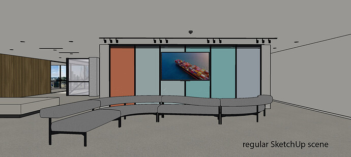
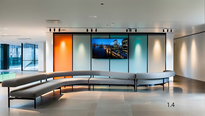
I took a screen shot of my SketchUp image also to show how far I have to pull back in order to get the normal view. (which then seems flat) With 1.4 it’s basically the same, not such a big difference between SketchUp file and preview pane view.
I also attached what I see when I first open 1.5 and try to get as wide a picture as possible; not too much of the image shows. Compare to what I get in 1.4 right off.
I think when you pull back so far in SketchUp file view, in order to get a normal view in the 1.5 preview pane, it ends up flattening the image.
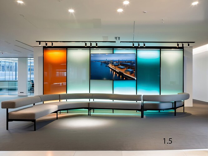
I included preliminary renderings and I think they both look pretty good. The glass is better in 1.5 (and even better in some other renderings not shown) so I’m anxious to use it, but something seems flatter about the shape of the sofa, and it seems closer to the glass wall, too, maybe, which it shouldn’t be.
Thanks.
.
