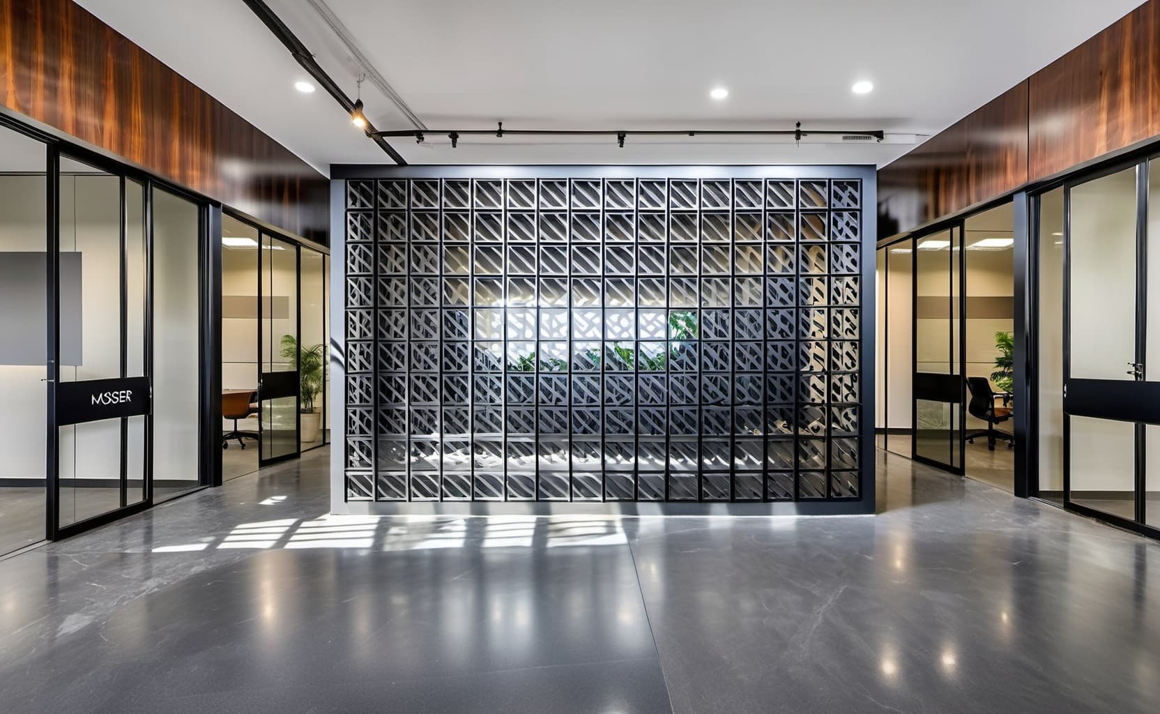
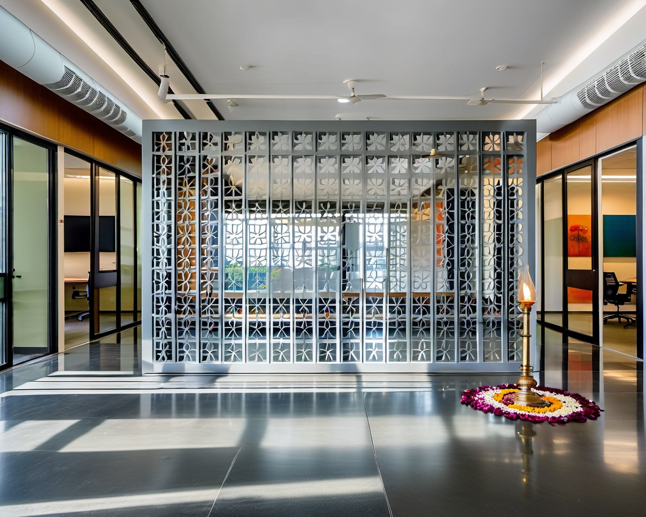
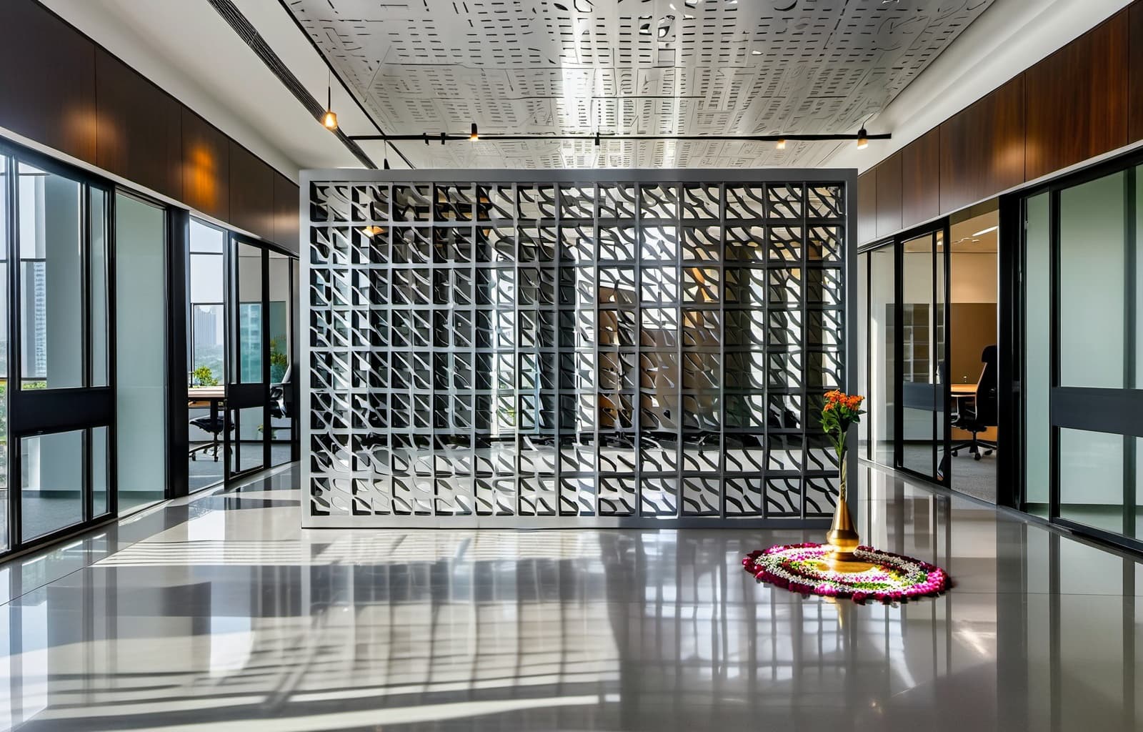
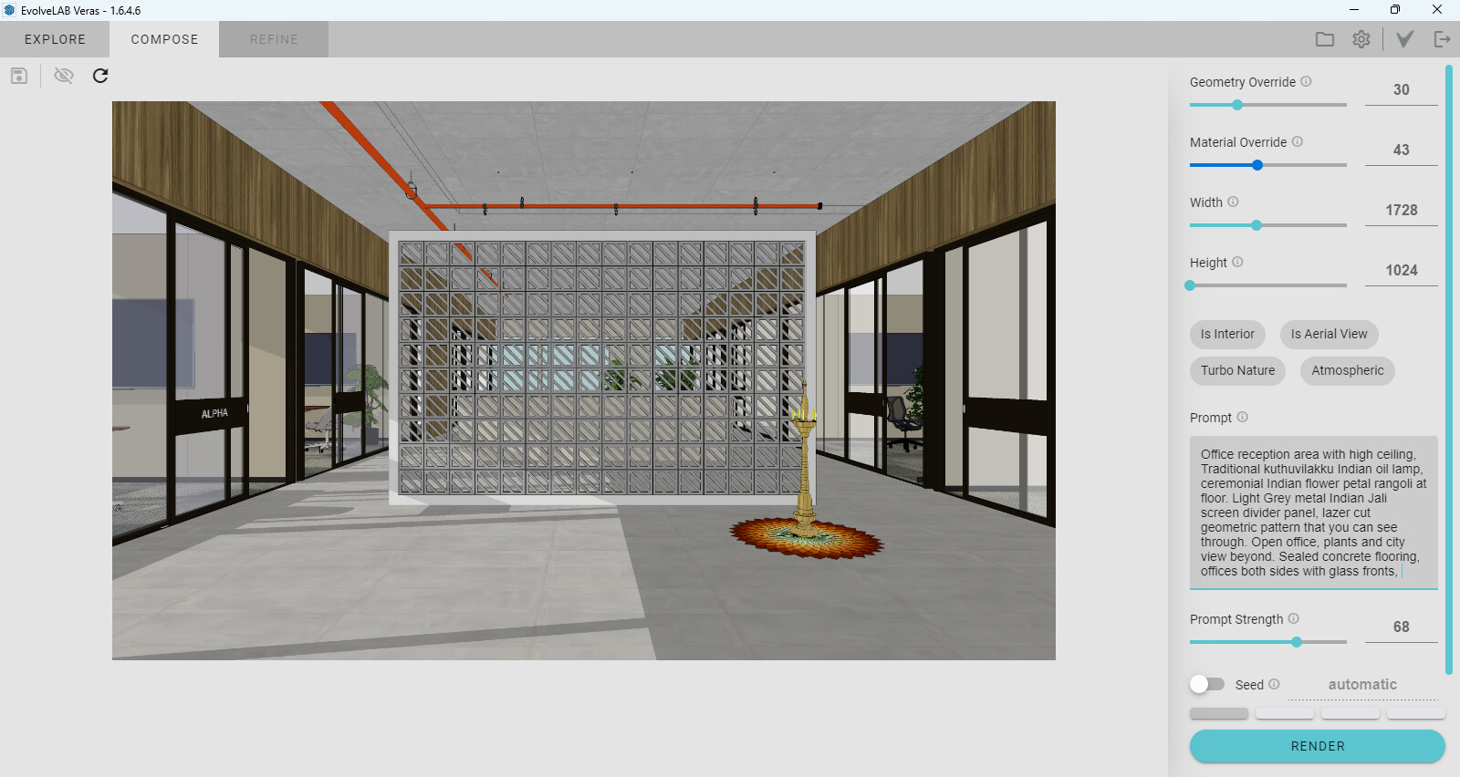
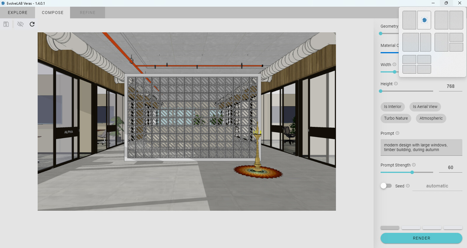
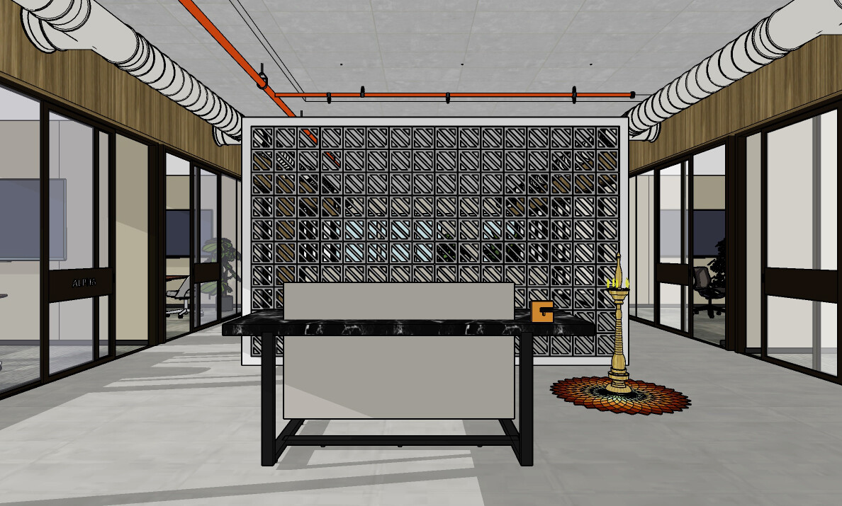
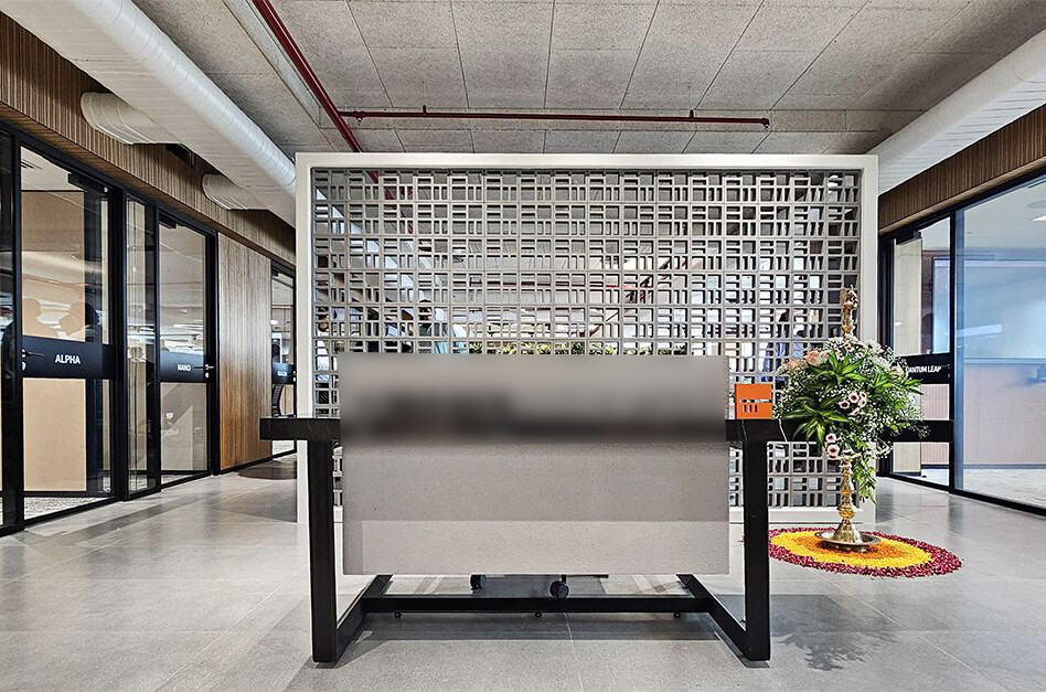
I’m happy with the results I get in the Veras web app and plug in. But I can’t get a good representation of this unusual metal screen space divider, in any version. I’ve attached typical results for the web app, plug in release 1.6.4.6, and release 1.4.0.1 as well (before preview pane lineweight changed), and screen shots of the preview pane linework for each.
I can’t seem to get a realistic finish on the metal divider itself. I’m not concerned about the rest of the scene; I’ve gotten good results for the other parts in both the web app and plugin. It’s just the metal screen surface that looks flat, not very photorealistic, in any version I’ve tried. And even in other non-metallic finishes it doesn’t look very realistic (which is why I switched to metal). I wonder why that would be? I even tried this with a simpler screen pattern with fewer divisions but the results were similar.
Here is what I usually say in the prompt about the screen:
“Pale grey polished metal Indian screen divider panel, open fretwork geometric pattern, office and view beyond.” Sometimes I add the word “jali” but that gives an overly detailed lacy pattern to the screen.
My settings are about 30 50 70.
I’ve also attached my SketchUp image and a portion of image of the original project photo. Thanks.