Could you explain a little more - what exactly are you looking for.
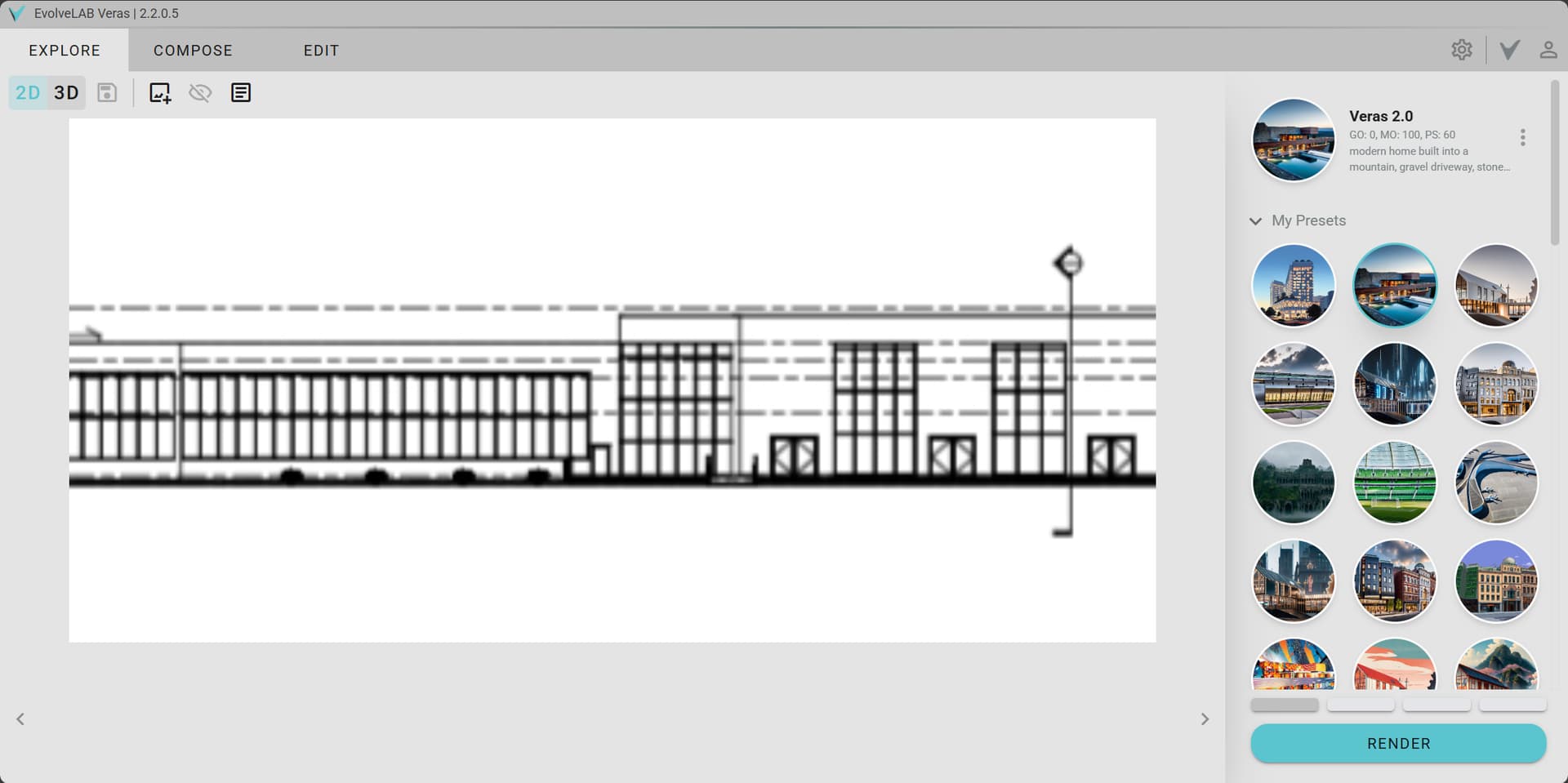
You could try setting Geometry Override to 0 and then try rendering to avoid modification on your floors (if that is what you are looking for)
Also using the same “Seed Value” will help you regulate the render aesthetics across different renders.
Welcome to the forums!
As @verma mentioned Geometry Override you want to start at 0, if you adjust the most you’ll want is 10 or you’ll get changes to the model.
Material Override will need to be 100 or close to it. This setting can be lower when the source image looks closer to what you are asking the AI to create. But in this case where its just lines you’ll need 90+
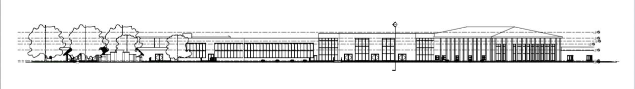
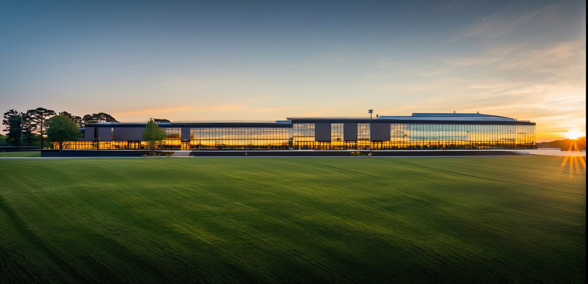
Start with a simple User Prompt, with this image I used.
commercial office space, large glass windows, shingle roof, large green trees, sunset, golden hour
Not perfect but a good starting point. Veras likes simple and strait to the point prompts.
Prompt Strength you’ll need to adjust, I usually start right at 50 and refine once I have a good Seed.
Be sure to save Presets as you go, I think of them as kind of checkpoints. I can go back and delete/clean them up once I have something locked in but it’s nice to reset back to something if your current path is not going the right way.
You’ll need to add some height to the image like I did above otherwise you’ll end up cropped like this.
Veras can’t accommodate very narrow aspect ratios.
When I find one that’s on the right track, I enable Seed to lock in that solution then start refining my settings. Try out some other words in the prompt to touch on things maybe its missing, add words to negative prompt to eliminate items its pulling in, adjust the Prompt Strength up or down depending on how dramatic you want the shot.
If you want the trees to look realistic, I recommend changing to a Realistic Visual Style in the view, so the RPCs show as trees rather than outlines. It will also benefit to have the material difference rather than just black and white. You’ll also get a nice sky gradient which again helps with the substrate image giving the AI more context to what is what.
You should also consider hiding the levels category and section markers in the view as they will be respected as much as any other lines.
AI image generation can sometimes feel like a chase, hopefully this write-up transfers a bit of what’s in my brain and my process to get you started on the right foot.